BANKSIDE GIN
London SE1
Bankside Gin is rooted in Southwark, one of London's oldest and most contested boroughs. The design draws its language from the former Bankside Power Station, whose transformation into Tate Modern remade the area's identity without resolving its contradictions. Like the borough itself, the brand holds the tension between working-class heritage and the relentless pressure of a city remaking itself in real time.
Services
Research & Strategy
Branding
Custom Glass
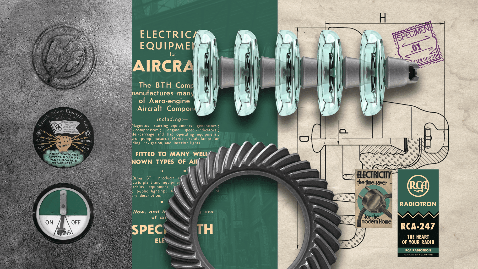
The bottle draws on two related references: the glass insulators of electrical infrastructure and the postwar optimism that once made industrial technology feel genuinely exciting. That era's visual confidence, expressed through early geometric sans-serif typography and bold graphic language, shaped the design direction. Decoration was applied through screen-printed ceramics, a technique that connects the bottle's finish to the industrial craft at the heart of the concept.






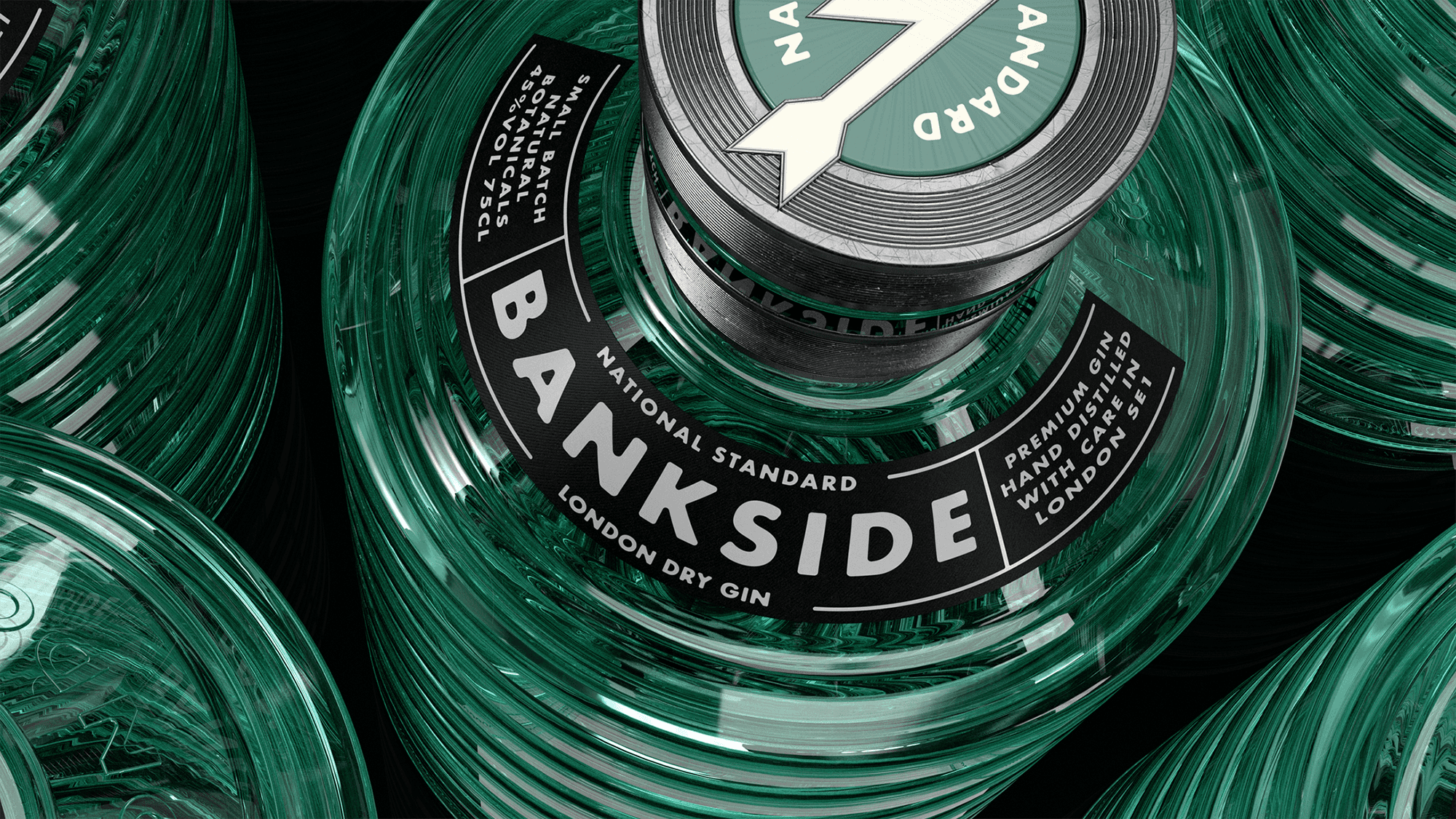
A custom closure and neck ring completed the bottle, giving the full package the coherence of something designed as a single object rather than assembled from parts. What drives the concept is a particular kind of nostalgia: for a time that never quite existed, when things felt simpler and technology still carried optimism. Tweaked, refined, sampled, mashed and remixed. Feels like home, but new.